The Ultimate Guide to Reviewing Web UI PRs
Indent helps companies manage temporary access to production and other cloud resources.
Implementing the UI poorly for Indent carries significant risks and consequences:
- In the worst-case scenario, inadequate quality in our engineering process poses a risk of creating security vulnerabilities.
- If our UI is not intuitive and user-friendly for our customers, there is a possibility that they may misconfigure their system, potentially leading to unauthorized access.
- Failing to deliver a delightful user experience could prevent us from establishing a solid reputation and building trust with our users.
This is why it’s been so important to us to put in place processes to ensure our UI updates are thoroughly reviewed and tested. We spent so much time thinking about this, we wanted to share our playbook. For the purposes of this guide, let’s use the Indent dashboard as an example.
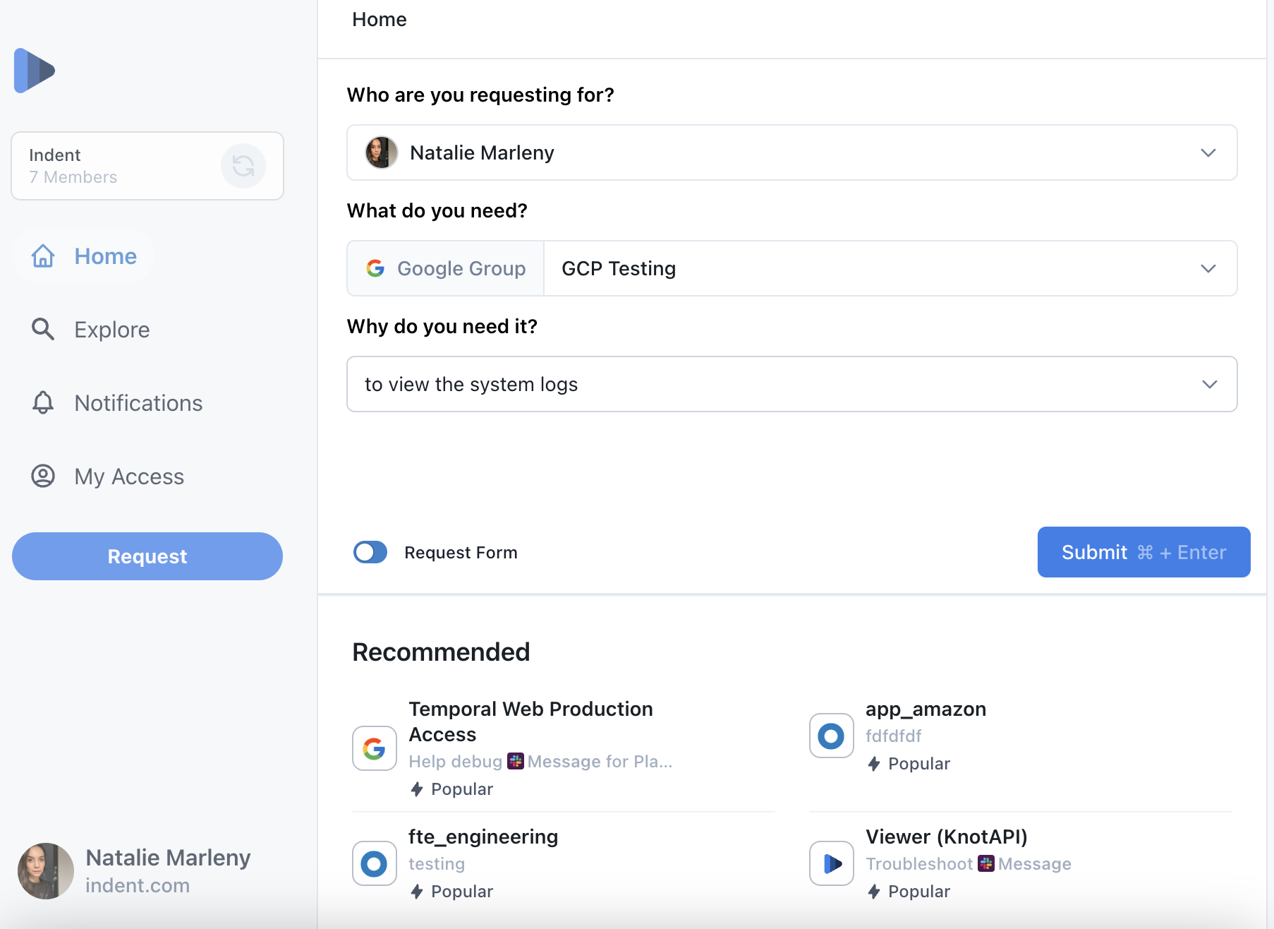
The web application called "dashboard" is the part of Indent that our customers interact with the most. They leverage the dashboard to view and manage many security controls important for their setup. This type of web application relies heavily on displaying and controlling system configuration using common web elements like forms, inputs, tables and lists.


Given the high importance of the correctness of the configuration in the dashboard, we deem it critical to always provide our users with:
- relevant and up-to-date data
- robust controls allowing for a predictable UX when affecting this data
- a pleasant overall experience that delights our users
“Web app page-completeness” checklist
When we implement a new feature in the dashboard, it usually consists of creating a new page to host it. To ensure we meet the requirements listed above, we need to get many different aspects of our pages just right. Occasionally we’ve missed the mark on an update because it was hard to keep track of what needed to be implemented on a particular page for it to be release-ready.
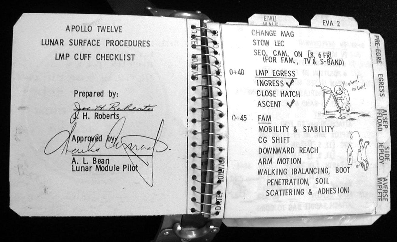
This is why we decided to take a page from NASA’s playbook and note all of the elements of a successful page update in a checklist. Checklists are a powerful and arguably an underutilized engineering tool, perfect for launching rockets and new features.

One of the checklists from the Apollo missions
We call the checklist that we created the “Web App Page-Completeness” checklist. Utilizing this checklist as the guideline document keeps our team in sync about the important components of an update during the development process. Team members with different purviews can contribute to the checklist in their own unique ways:
- Team members focusing on design use it to provide visual guidance in the interest of standardizing the UI visually. For example, we now require that a 404 (Not Found) page still displays the navigation menus.
- Team members focusing on the logic provide coding guidance in the interest of standardizing the UI behavior, thus improving the development speed and the robustness of the UI. For example, we require the use of a specific Spinner component to represent the loading state.
We don't formally track each item for every code change, but instead rely on the familiarity and judgment of our team members that implement and review the code. Alternatively, the checklist could be used as a metric, indicating the completeness of a page within the development team in the PR implementing a page or within a code comment.
In an ideal world all of the requirements from the checklist could be checked automatically (via a lint rule), but we’ve yet to implement that. Some of the items in the checklist are applicable to all of the pages of a web app, while others are applicable only if the page meets certain conditions (for example, the page has a dynamic path).
Here’s our Web App Page-Completeness checklist:
- Clearly indicate states
- entire page is loading
- entire page is revalidating (while showing stale data)
- entire page is being submitted (create, update, delete)
- a page element is loading
- a page element is revalidating (while showing stale data)
- Handle data appropriately
- indicate when data is missing (404 page)
- ensure data is fresh (periodic update, live update or update on focus)
- ensure data is robustly retrieved (re-fetched on failure)
- Ensure common utilities are used consistently
- in-app links between pages (next/link)
- data fetching (SWR, TanStack Query)
- local storage management
- global state management
- Indicate status where appropriate
- notify on success
- notify on recoverable failure
- notify on unrecoverable failure
- Forms
- consistently validate forms
- highlight invalid inputs
- disallow saving if local data equals remote data
- highlight inputs whose data differs from remote data
- UX
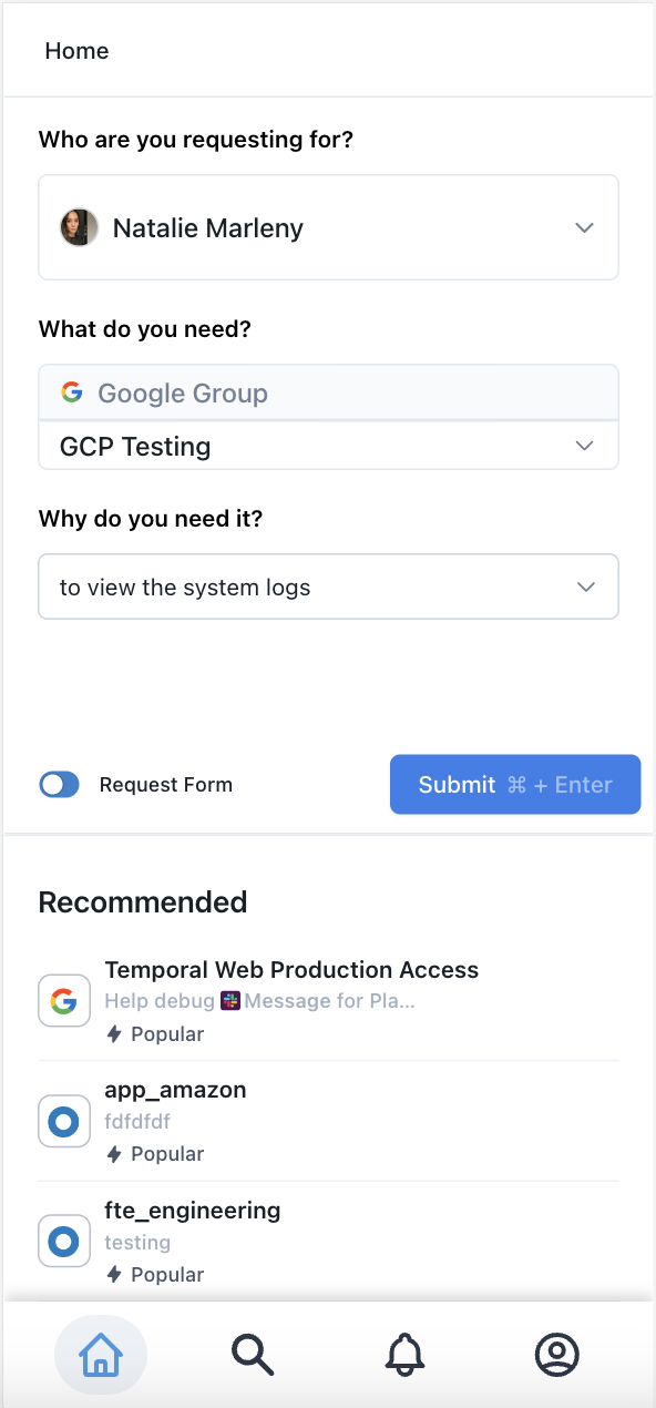
- page is responsive (renders well on mobile)
- page is keyboard navigable
- page is navigable by screen-readers
- page code is semantic
- page code is performant
- Help
- tooltips on hover where appropriate
- “help” or “contact support” where appropriate
Tools > Process
Our checklist is possibly the biggest offender to our general view that tools should be favored over process, since process can only go so far.
Tools help make doing the right thing easy by containing the codification of the principles that the team has agreed upon.
Here’s a quick overview of some of the tools we find the most helpful:
Comments in Vercel for Feedback
Getting feedback from your fellow teammates is a breeze when providing feedback is so easy, so we’ve been loving comments in Vercel Deployments. Since we started using this Vercel feature, we’ve found that previews speed up time-to-feedback by 80% (Indent case study).
Lighthouse for Accessibility and Performance Tracking
To track the accessibility and performance of our app we frequently check our Lighthouse score. We’ve found that using Next.js as our UI framework is getting us a long way towards our goal by itself. In addition, it’s really easy to keep our app responsive since we’re styling our app almost exclusively with Tailwind CSS which is famous for its “mobile first” philosophy.
Playwright for E2E Testing
There are many tools that allow for E2E testing of a Web app, but our favorite is Playwright. We’ve found it really straightforward to write sophisticated checks that keep the core experience of our web app stable even when our app changes a lot.
Hemingway and ChatGPT for Copy Checking
When we need to check a copy somewhere in the Indent app, Hemingway and ChatGPT are supremely useful.
Suggestions Welcome
By using the right tools, whether they be checklists or software, we’ve found that we’re able to release higher quality updates more quickly. We’re always eager to hear how other folks approach their releases. If we missed anything or if you have an amazing tool to share, please reach out!


